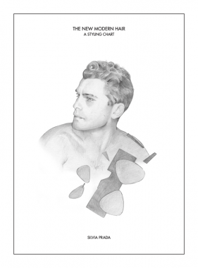

Silvia Prada, The New Modern Hair: A Styling Chart
Softcover, 32 pp., offset 1/1, 200 x 270 mm
Edition of 500, hand numbered
ISBN 978-0-615-66610-5
Published by cultureEDIT and Silvia Prada
$35.00 ·
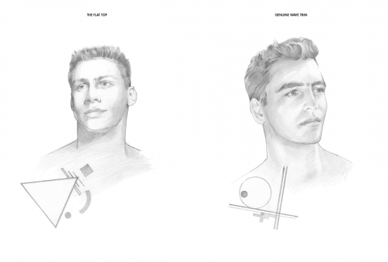
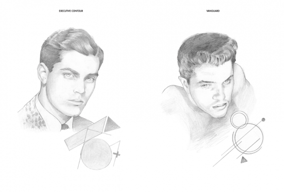
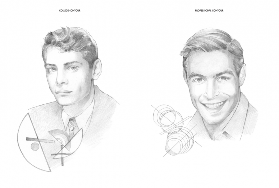
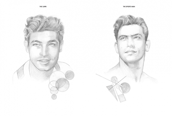
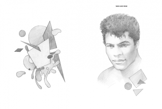
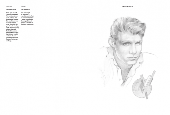
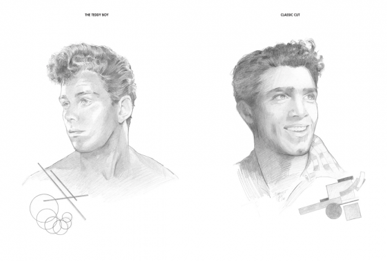
THE NEW MODERN HAIR: A STYLING CHART features a series of stylized portraits highlighting male hairstyles juxtaposed with geometric drawings. The book pays homage to the barbershop and is an artistic representation of the subtle nuances and cues that help define the male persona, identity and representation within the parameters of visual and popular culture. Through this series of work, Prada is capturing the typecasting and idealized character building that has become ingrained in our minds through media, pop culture and iconography.
The portraits — with names ranging from The Flat Top to Executive Contour — feature commentary and meticulous instructions on how to obtain each look in order to resemble the lifestyle pictured. The geometric drawings, all whimsical remixes of 20th-century art movements such as Bauhaus, De Stijl and Russian Constructivism, highlight the emphasis on the shape for each hairstyle and command a manifesto for the references that each portrait points to.


Art, Barbershop, CultureEDIT, Design, Distribution, Fashion, Holli Smith, Joakim Andreasson, Liza Kaplan, Michael Forrey, Miguel Figueroa, Setanta, Silvia Prada, Styling


Tony Martin, The Variable Place
Edited by Camilla Padgitt-Coles and Nicky Mao
Softcover, 104 pp., offset 4/4, 8 x 10 inches
Edition of 350
Published by AB-SENS PRESS
$28.00 ·
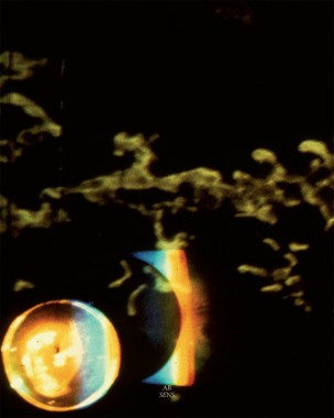
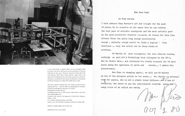
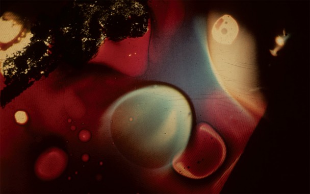
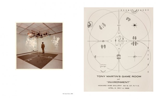
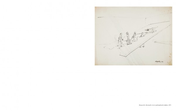
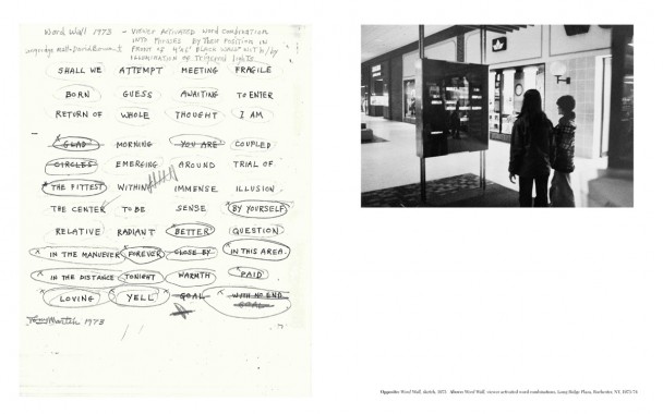
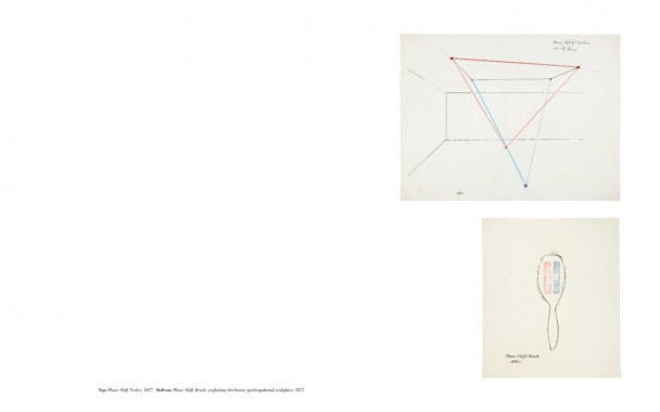
Tony Martin arrived to San Francisco in 1962, promptly forging creative alliances and lifetime friendships with “new music” people Morton Subotnick, Pauline Oliveros, and Ramon Sender. When the San Francisco Tape Music Center moved to its location at 321 Divisadero St., Martin was invited by co-directors Sender and Subotnick to become the Visual Director. With special attention paid to working in the tape music medium, as well as performing regularly, they joined with Mills Center for Contemporary Music in ‘67. During the SFTMC days Martin was responsible for numerous visual compositions, including Terry Riley’s In C performance, as well as Sender’s Desert Ambulance. Martin was deeply engaged in experimenting with light via overhead and slide projectors, mixing paint, oil, water, and objects to build his light compositions. His following grew as a culture of psychedelia pervaded the 1960s and his light shows became popular amongst bands such as Jefferson Airplane and Grateful Dead. During this time he began to build “interactions” by engineering entire environments using sensors and mirrors. By the late ’60s he returned to New York City where he continued his focus for these types of installations; time and time again synthesizing his technological skills with painting as a moving image. A painter at heart, he continued with consideration of his experience working with his viewer-activated sculptures, as well as his devotion to the medium of light — maintaining a thread that binds all aspects of his work. His latest piece entitled Proximity Switched Installation (2012) is a clear culmination of a lifetime of experimentation/production. A video demonstration of this installation is available to view online and includes musical accompaniment by Compound Eye (Spring Press).
The Variable Place is the first book of its kind to tie together over 50 years of Tony Martin’s work. It includes an in-depth interview with Martin by Will Cameron, Albert Herter and the editors. As well as a special introduction by long-time friend/collaborator Pauline Oliveros.


AB-SENS PRESS, Albert Herter, Art, Camilla Padgitt-Coles, Compound Eye, Culture, Design, Distribution, Morton Subotnick, Music, Nicky Mao, Pauline Oliveros, Performance, Photography, Ramon Sender, San Francisco, Terry Riley, Tony Martin, Will Cameron


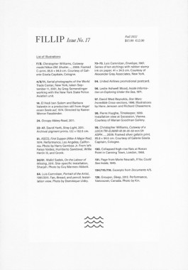
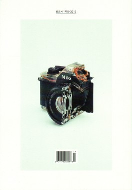
fillip 17
Softcover, 156 pp., offset 4/1, 170 x 245 mm
Edition of 2500
ISSN 1715-3212
ISBN 978-1-927354-07-0
Published by Fillip
$15.00 ·
Fillip is a publication of art, culture, and ideas released three times a year.
Taking as its point of departure Giorgio Agamben’s suggestion that subjectivity emerges from the relentless struggle between living beings and the various apparatuses in which they are captured, Apparatus, Capture, Trace, reflects on the links between such apparatuses whose operations today appear increasingly intertwined: photography and biopolitics.
1. Series: Apparatus, Capture, Trace
2. David Geers, Open Call
3. Walid Sadek and Mayssa Fattouh, Tranquility is Made in Pictures
4. David Hartt, Stray Light (Portfolio)
5. Renato Rodrigues da Silva, El Instrumento y Su Obra
6. James Langdo, A Eulogy for the Cutaway
7. Miwon Kwon and Helen Molesworth, Documents Magazine, 1992-2004
8. Caren Kaplan, Aerial Photography as Biopower in the Visual Culture of 9/11
9. Maria Muhle, Imitation of Life: Biopolitics and the Cinematographic Image
Art, Caren Kaplan, David Geers, David Hartt, Design, Distribution, Fillip, Giorgio Agamben, Helen Molesworth, James Langdo, James Langdon, Jeff Khonsary, Kate Steinmann, Kristina Lee Podesva, Maria Muhle, Mayssa Fattouh, Miwon Kwon, Renato Rodrigues da Silva, Walid Sadek


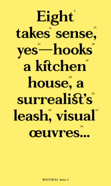
Ginny Cook and Kim Schoen, MATERIAL 3
Softcover, 96 pp. + insert, offset 2/1, 160 x 270 mm
Edition of 500
ISBN 978-0-9801441-2-3
Published by MATERIAL Press
$15.00 ·
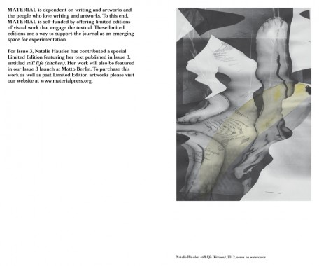
MATERIAL exists as a platform for the artist’s voice. Each issue brings together a different group of artists who write, as well as a new collaboration with a graphic designer. During the production of this third issue, our designer Zak Jensen put forth the idea of concatenation — the act of linking together, or the state of being joined (
It was caused by an improbable concatenation of circumstances) (there was a connection between eating that pickle and having that nightmare)
(the joining of hands around the table).
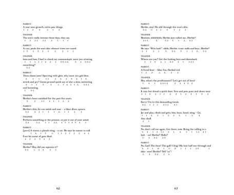
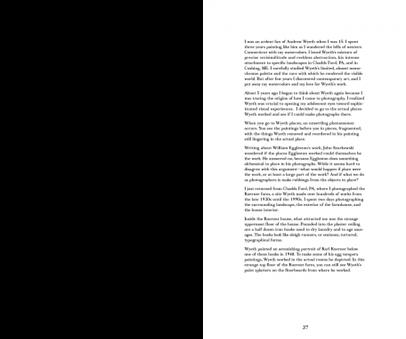
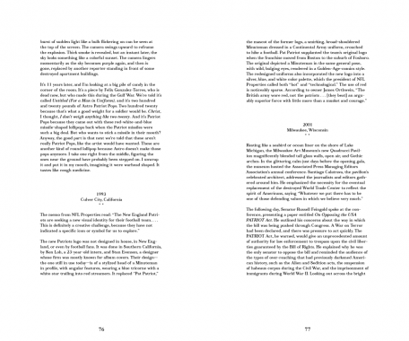
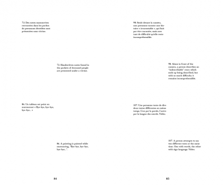
Concatenation (c.1600, from L.L. concatenatus, pp. of concatenare “to link together,” from com- “together”+ catenare, from catena “a chain”) seemed an appropriate word for our editorial method. An unlikely assemblage of texts becomes connected through this process; uncanny linkages emerge. Wyeth appears twice. Performances interact. In this issue: voices that duel, voices that parrot, voices that hypothesize, translate, and meditate, voices that speak simultaneously. As Roland Barthes writes, we have assembled these textual events, as “pleasure in pieces; language in pieces; culture in pieces,” to build upon one another into something new.*
*Roland Barthes, The Pleasure of the Text, trans. Richard Miller (New York: Hill and Wang, 1975), p. 51
CONTRIBUTORS
Farrah Karapetian, Paul Zelevansky, Renee Petropoulous, Nate Harrison, James Welling, Natalie Häusler, Harold Abramowitz, Shana Lutker Stephanie Taylor, Alice Könitz, Frank Chang, and Emily Mast.


Alice Konitz, Andrew Wyeth, Art, Catherine Guiral, Concatenare, Criticism, Daniel Lucas, Design, Distribution, Dorit Cypis, Emily Mast, Farrah Karapetian, Frank Chang, Ginny Cook, Harold Abramowitz, James Welling, John Stezaker, Jonathan Miles, Kim Schoen, MATERIAL Press, Natalie Häusler, Nate Harrison, Olivier Richon, Paul Zelevansky, Quentin Walesch, Renee Petropoulous, Richard Miller, Roland Barthes, Shana Lutker, Stephanie Taylor, Theory, Thomas Lawson, Typecraft Wood & Jones, Typography, Wendy Schoen, Zak Jensen

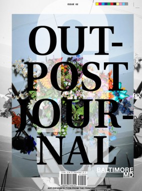
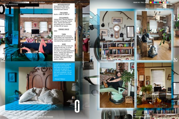
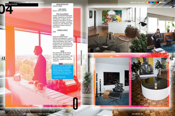
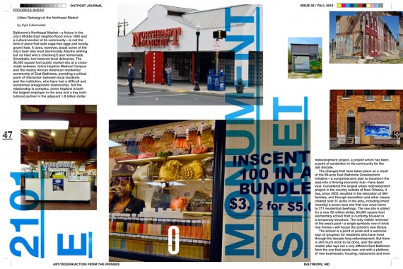
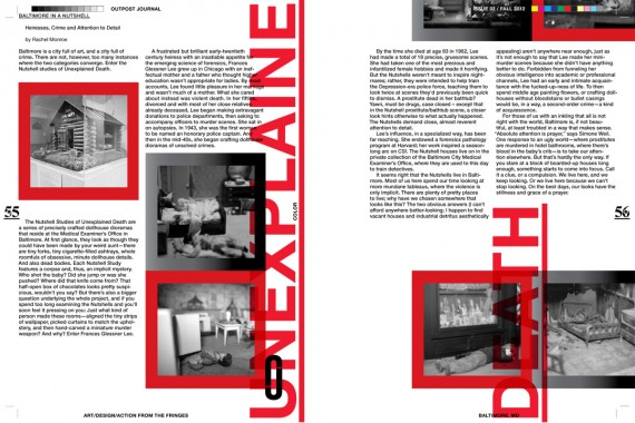
Outpost Journal 2, Baltimore
Softcover, 64 pp. + insert, offset 4/4, 9 x 12 inches
Edition of 500
ISBN 978-0-9836082-1-9
Published by Outpost Journal
$15.00 ·
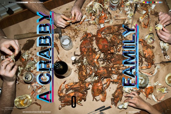
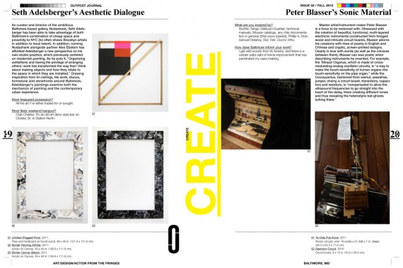
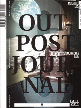
Outpost is an annual print publication on art, design and community action from cities that have been traditionally underexposed beyond their local contexts. Each beautifully produced and visually engaging issue of Outpost focuses on a single urban location and comes packaged with a limited edition print by an artist from the featured city. Outpost is a journey into the creative heart of a place, and via features like “Secretly Famous” (profiles of the most infamous artsy locals), guerrilla engagements with tourist attractions, historical explorations, mapping projects, and deep dives into artist collectives and organizations, Outpost exposes the myriad ways in which unique local communities arise through creative collaboration and production.
Exploratory and playful, critical with a sense of levity, and inspired by hand-drawn maps, flags, totem poles, poorly pixelated iPhone photos, moody landscapes, and the spirit of adventure, Outpost is dedicated to strengthening ties between communities and spreading new ideas about how creative culture can change our world.


Aja Blanc, Alex Kwartler, Anusha Venkataraman, Architecture, Art, Boddan Mohora, Bogdan Mohora, Caitlin Cunningham, Carly Ptak, Clay Rockefeller, Culture, Dan Deacon, Design, Distribution, Elizabeth Evitts Dickinson, Gary Kachadourian, Gillian Kiley, James Rieck, Jay Peter Salvas, Jeanne Vaccaro, John Bohl, Jori Ketten, Kyla Fullenwider, Laure Drogoul, Lesser Gonzalez Alvarez, Loring Cornish, Luke T. Baker, Maggie Lange, Manya Rubinstein, Matthew Williams, Mike Taylor, Outpost Journal, Patrick Casey O'Brien, Pete Oyler, Peter Blasser, Phoebe Jean, Phoebe Jean Dunne, Rachel Monroe, Seth Adelsberger, Shaun Flynn, Twig Harper

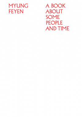
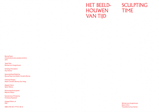
Myung Feyen, A Book About Some People And Time
Softcover, 126 pp., offset 2/2, 170 x 240 mm
Edition of 500
ISBN 978-90-77713-48-8
Published by Myung Feyen
$33.00 ·
When you meet Myung Feyen, you are never quite sure at what point everyday life spills over into art. Her letters arrive in archaic envelopes, handwritten or typed on an old fashioned typewriter on paper salvaged from an archive or a bankrupt stationery store. Such a letter becomes a unique ‘object’, a piece of graphic design. Her texts, however intentionally mundane, are meticulously crafted, often with an unexpected poetical twist. A correspondence regarding an upcoming appointment can easily turn into a small collection of poetry or visual art.
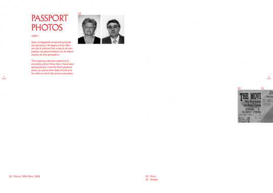
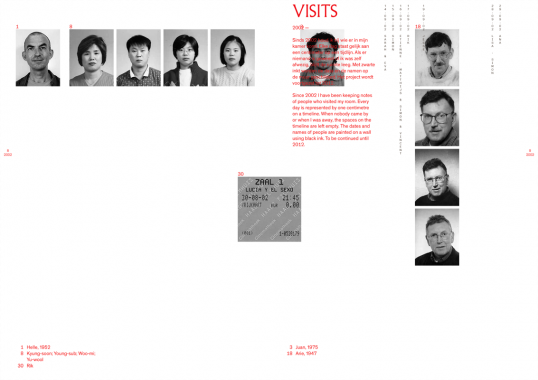
Such a correspondence cannot be distinguished from the projects, which she presents as works of art. She has a collection of passport photographs of people who have played an important role in her life in some way, accumulated since her early youth. She takes photographs of her parents on every occasion she meets them, keeping the photos in an archive along with the date they were taken. For years she has been making lists of everybody who has come over to visit her. She also creates diagrams of this information — strange calendars drawn on the walls of exhibition spaces. She collects water and sand of places she or her friends have visited. These samples are packed and kept in a standard uniform method and then documented. Bit by bit, an atlas containing the voyages of Myung Feyen and her friends comes into being.


Art, Carvalho Bernau, Design, Distribution, Guy Harries, Kai Bernau, Malcolm Sutton, Michael van Hoogenhuyze, Myung Feyen, Susana Carvalho


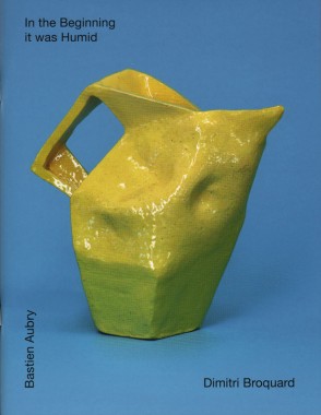
Bastien Aubry and Dimitri Broquard, In the Beginning it was Humid
Softcover, 48 pp., offset 4/4, 195 x 255 mm
Edition of 1000
ISBN 978-3-905999-03-7
Published by Nieves
$20.00 · out of stock
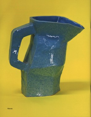
For several year, Bastien Aubry and Dimitri Broquard have been making work inspired by outsider art or the applied arts like handcrafts or ceramics. It appears as if they both don’t think much of rules and that they just spontaneously adapt their ideas. That makes their work fresh and full of expression.
In the Beginning it was Humid — their fourth publication with Nieves — features a broad selection of their ceramic works from the last few year, and concludes with a short story by A.C. Kupper.
Bastien Aubry (1974) and Dimitri Broquard (1969) established the two-man design studio Flag in 2002. They work for art and cultural institutions, producing catalogues, artists books, magazines and posters. FLAG also creates drawings, illustrations for editorials and private projects. Both Broquard and Aubry respectively teach at art schools in Switzerland.
A.C. Kupper, and Dimitri Broquard, Art, Bastien Aubry, Ceramics, Design, Distribution, Flag, Nieves

The Book Trust Prospectus
Edited by Benjamin Critton, Harry Gassel, Brendan Griffiths, Zak Klauck and Mylinh Nguyen
Softcover, 160 pp., offset 1/1, 4.25 x 7 inches
Edition of 500
ISBN 978-1-928570-15-8
Published by IFS, Ltd.
$19.10 ·
The Book Trust, a site-specific publication and installation, was originally presented at the NY Art Book Fair, 5–7 November, 2010. During those days, the semi-fictional
Investment Futures Strategy, Ltd., comprised of five graduate students from the Department of Graphic Design at the Yale University
School of Art, offered an original publication for trade in a series of barters executed by its authors.
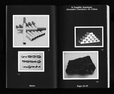
The Trust and the accompanying Book Trust Prospectus address matters of micro-economy and distribution, as well as prescribed versus perceived value. The project suggests a new currency specific to the setting of the Book Fair, a context in which a distinct set of commodities is exchanged by like-minded vendors in a finite space and time. It is only in this setting that a book could be posited as capital — a literal stand-in for the money that commonly exchanges hands at the Fair. Perceived worth is thus no longer dictated by edition or price, but instead by a trader’s subjective notion of the values they assign each book.
Over the three days of the Fair, the book, produced in a fixed quantity of 500, varied in value as each negotiation determined and redetermined its worth in the marketplace. With each transaction, the Prospectus assumed the value of the book for which it was exchanged. The traded commodities now comprise The Book Trust — a value-appreciating book bank. By trading with IFS, Ltd., participants acquired a single theoretical share of the bank, the Prospectus acting as a document of that transaction. In framing the project in a format similar to that of a stock exchange, IFS, Ltd. hopes that the Trust emphasizes the tenuous, abstract value of the book: as a designed object, as a medium for content, as a traded commodity, and as a symbol of participation in the project itself.
Prospectus
The Book Trust Prospectus is, in non-equal parts: a local currency, a stock prospectus for The Book Trust, an exploration into the nature of small-scale publishing and its presence at the NY Art Book Fair (R. Giampietro), a survey of precedented alternative currencies (B. Critton), a platform for hyperbolic re-representations of anonymous fiat money (R. Rozendaal), a foray into corporate branding and rebranding (Metahaven et al.), a proposal for a time-based repurposing of existing banknotes (N. Hirsch & Z. Kyes), an analysis of the current state of [art] book-publishing and -design (L. v. Deursen et al.), a venue for research into non-essential commodity futures like tulips and Beanie Babies™ (H. Gassel), a profile of independent art book vendors (Golden Age), and a podium for experimentation with anti-counterfeiting guilloché renderings (B. Griffiths & Z. Klauck). It is the story of its own making and financing as well as an evaluation of the context in which it was made and financed. The Prospectus is a 160-page, perfect-bound, one-colour book, offset-printed in an edition of five hundred by GHP printing in West Haven, Connecticut, USA.
Alexander Rives, Art, Benjamin Critton, Brendan Griffiths, Business, Design, Distribution, Golden Age, Harry Gassel, IFS Ltd., Linda van Deursen, Metahaven, Mylinh Nguyen, Nikolaus Hirsch, Rafael Rozendaal, Rob Giampietro, The Book Trust, Typography, Yale University School of Art, Zak Klauck, Zak Kyes

Sharmini Pereira, Oliver Knight and Rory McGrath, Footnote to a Project*
Softcover, 536 pp., offset 4/1, 210 x 310 x 35 mm
Edition of 2000
ISBN 978-0-9560704-5-6
Published by Abraaj Capital Art Prize
$35.00 ·
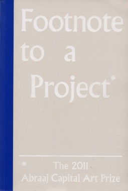
Conceived in collaboration with curator Sharmini Pereira design studio OK-RM and published on the occasion of the 2011 Abraaj Capital Art prize, Footnote to a Project* is a collection of images, citations and references that support and inform the creation of the five selected artworks. Informed by the book’s title, the headline concept was to express the historical traditions of footnoting and its relationship with reading and writing. The designers adopted the use of a variety of typographic symbols traditionally used by type setters to indicate footnotes. The book takes the form of an enlarged paper back and is split into 5 equal parts — one for each artist — providing an in-depth documentation of the works through images and extended captions. The book is accompanied by two book marks intended to facilitate navigation between image and text.
Abraaj Capital Art Prize, Art, Art Dubai, Culture, Design, Distribution, Hamra Abbas, Jananne Al-Ani, Joanne Bernstein, Jonathan Katona, Laura Egerton, Michael Bodiam, Nadia Kaabi-Linke, OK-RM, Oliver Knight, Rory McGrath, Sharmini Pereira, Shezad Dawood, Thomas Brown, Timo Nasseri, Toby Jury Morgan, Typography

Art & Seoul Magazine 2
Softcover, 36 pp., offset 4/4, 210 x 275 mm
Insert: booklet, 20 pp., offset 4/4, 148 x 210 mm
English and Korean
Edition of 1000
Published by Art & Seoul
$10.00 · out of stock
Art & Seoul is a biannual, bilingual, arts and culture magazine which highlights the work of artists and designers from Korea through interviews, essays, profiles, and various collaborative projects.
Andreas Duschek, Art, Art & Seoul, Culture, Design, Distribution, Fashion, Go Daegun, Kam Donghwan, Marie Tae McDermott, Nakion, Nikki S Lee, Nina Ahn, Patrick Tsai, Photography, Teo Lee, Yoo Byungseo

C Magazine 111, Libraries
Softcover, 60 pp., offset 4/1, 210 x 295 mm
Edition of 2200
ISSN 1480-5472
Published by C Magazine
$7.50 ·
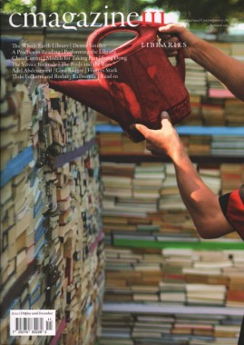
Issue 111 Libraries includes features by Adam Lauder on Performing the Library; Jen Hutton on Dexter Sinister; David Senior on the Whole Earth Catalogue; Randy Lee Cutler on Reading; Pandora Syperek on ILLUMINnations: the 54th Venice Biennale; Jenifer Papararo on Frances Stark: I’ve Had it and a Half at The Hammer Museum, and an artist project by Read-in. Issue 111 also includes reviews of: Rabih Mroué: The Inhabitants of Images at Prefix ICA; Song Dong: Waste Not at the Vancouver Art Gallery; Gina Badger: Mongrels at Issue Project Room; Adel Abdessemed: The Future of Décor at OCAD Professional Gallery; Chris Curreri: Something Something at University of Toronto Art Centre; The Birds and the Bees at Oakville Galleries; The Domestic Queens Project at FOFA Gallery, Concordia, and Wim Botha: All Around at Galerie Jette Rudolf. Also included is a review by the 2011 C New Critics Competition winner Kari Cwynar on Models for Taking Part at Presentation House Gallery.
Adam Lauder, Adel Abdessemed, Art, C Magazine, Chris Curreri, David Senior, Design, Dexter Sinister, Distribution, Frances Stark, Galerie Jette Rudolf, Gina Badger, Hammer Museum, Jen Hutton, Jenifer Papararo, Kari Cwynar, Libraries, Pandora Syperek, Rabih Mroué, Randy Lee Cutler, Read-in, Song Dong, Whole Earth Catalogue, Wim Botha

MacGregor Harp and Victor Hu, MS Sans
Softcover, 84 pp., offset 1/1, 6 x 8 inches
Edition of 500
Published by Cheap Art America
$5.00 ·
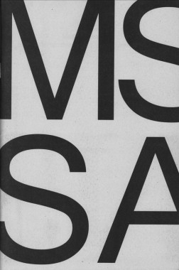
A celebration of the mundane. MS Sans invites thirteen contributors to explore the potential of the typeface Microsoft Sans.
“Each glyph feels as if constructed from rigid individual bits expressing no empathy for the bows and straights of the other. Compare these letterforms to the negative spaces of its progenitor Helvetica; whence MS Sans borrowed its original file name, helv.tff. Inspect closely how the stems of the lowercase b, d, g, p, and q bend not to their respective bowls. O, daughters and sons of the New House what brother of Arial is this? What absent father’s nose is present in this numeral 1? And to whose crooked grandmother do we blame thine unspinely 8? Yet take no offense. Similar results manifest when a gaze is exercised on your humble narrator.”
— Stewart Smith
Anthony Salvador, Art, Cheap Art America, Chris Palazzo, Culture, Design, Distribution, GUNMAD, Jeremy Landman, Jiminie Ha, MacGregor Harp, Microsoft, MS Sans, Nicolas Borel, Project Projects, Sam Farfsing, Samuel Banziger, Stewart Smith, Typography, Victor Hu
