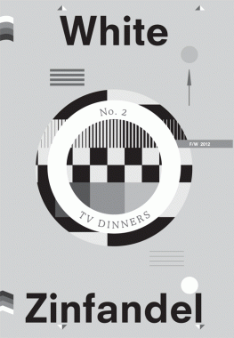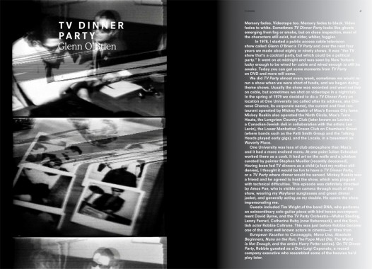

White Zinfandel 2, TV Dinners
Softcover, 116 pp., offset 4/1, 9 x 13 inches
Edition of 500
Published by W/— Projects
$20.00 ·
A biannual publication by
W/— Projects in collaboration with
Leong Leong Architecture,
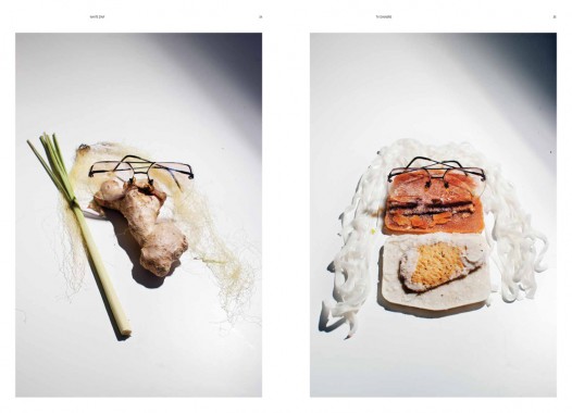
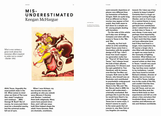
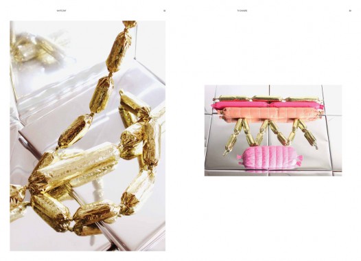
White Zinfandel is devoted to the visual manifestation of food and culture produced within the lives of creative individuals. The second issue of
White Zinf, as its editors have come to call it, brings together a mostly-new cast of characters who have devoted their creative energies to indulge a sometimes perverse obsession with art and food. The first issue of White Zinf was inspired by the ethos of Gordon Matta Clark’s FOOD restaurant — raw, resourceful and a celebration of New York’s downtown artist community in the 1970s.
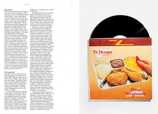
For the second issue, the pendulum has swung in the opposite direction. Rather than the singular and novel, it is inspired by the generic and banal. As a perfect marriage of pragmatism and cultural excess, the TV dinner represents a culinary baseline that spans nearly fifty years. Its origins can be traced to middle America in the early ‘60s and various processed food companies.
But the exact moment of the TV dinner’s invention is vague, not unlike the processed foods sealed within. As an archetype and common denominator of Western Pop culture, the TV dinner spans our collective nostalgia with conflicting sensations of comfort and disgust.


Alexander Provan, Alexis Georgopoulos, Alis Atwell, Annie Choi, Art, Asher Penn, Ashley Rawlings, Brandy Carstens, Brian Janusiak, Buehler Vineyards, Chris Leong, Colonie, Confetti System, Daniel McDonald, Design, Distribution, Dominic Leong, Elizabeth Beer, Eric Adolfsen, Felix Burrichter, Flora Springs, Food, Glenn O’Brien, Gordon Matta-Clark, Jack Hanley, Jiminie Ha, Julia Sherman, Kathryn Garcia, Keegan McHargue, Leong Leong Architecture, Letha Wilson, MacGregor Harp, Michael Bell-Smith, Michele Abeles, Nick Paparone, Parrish Rash, Pete Deevakul, Pirate Press, Project No. 8, Revival Vineyards, Rirkrit Tiravanija, Ruby Sky Stiler, Ry Wharton, Sara Greenberger Rafferty, SOFTlab, St-Germain, Stephanie Choi, Talia Chetrit, Van Dissel, W/— Projects, White Zinfandel, Yemenwed

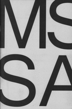
MacGregor Harp and Victor Hu, MS Sans
Softcover, 84 pp., offset 1/1, 6 x 8 inches
Edition of 500
Published by Cheap Art America
$5.00 ·
A celebration of the mundane. MS Sans invites thirteen contributors to explore the potential of the typeface Microsoft Sans.
“Each glyph feels as if constructed from rigid individual bits expressing no empathy for the bows and straights of the other. Compare these letterforms to the negative spaces of its progenitor Helvetica; whence MS Sans borrowed its original file name, helv.tff. Inspect closely how the stems of the lowercase b, d, g, p, and q bend not to their respective bowls. O, daughters and sons of the New House what brother of Arial is this? What absent father’s nose is present in this numeral 1? And to whose crooked grandmother do we blame thine unspinely 8? Yet take no offense. Similar results manifest when a gaze is exercised on your humble narrator.”
— Stewart Smith
Anthony Salvador, Art, Cheap Art America, Chris Palazzo, Culture, Design, Distribution, GUNMAD, Jeremy Landman, Jiminie Ha, MacGregor Harp, Microsoft, MS Sans, Nicolas Borel, Project Projects, Sam Farfsing, Samuel Banziger, Stewart Smith, Typography, Victor Hu
