fillip 11
Softcover, 120 pp., offset 4/1, 170 x 245 mm
Edition of 2000
ISSN 1715-3212
Published by Fillip
$15.00 ·
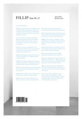
Inaugurating a new, bound format that remains true to its broadsheet roots, Fillip’s Spring 2010 issue features Lawrence Rinder on painting and politics, Keith Bormuth on Jean-Luc Godard’s
2 ou 3 choses que je sais d’elle, and Berlin-based artist Haris Epaminonda in conversation with Danish curator Jacob Fabricius. Other long form reviews and essays are provided by Liz Park, Renato Rodrigues da Silva, and Arni Haraldsson, amongst others.
The issue also features Dear Silvia…July 2009, an artist pamphlet by Silvia Kolbowski that compliments the artist’s audio work of the same name commissioned by Fillip for the Living Clay Art Writing Readings series at Whitechapel, London, last Fall:
Silvia Kolbowski, Dear Silvia…July 2009
Softcover, 16 pp., offset 3/3, 120 x 180 mm
Edition of 2300
ISBN 978-0-9738133-8-8
Published by Fillip
Arni Haraldsson, Art, Criticism, Distribution, Fillip, Haris Epaminonda, Jacob Fabricius, Keith Bormuth, Lawrence Rinder, Park, Photography, Renato Rodrigues da Silva, Silvia Kolbowski, Theory

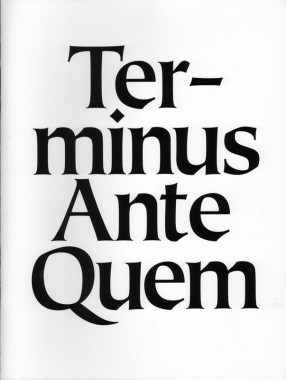
Terminus Ante Quem
Softcover, 8 pp., offset 1/1, 8 x 10 inches
Edition of 500
Published by Shane Campbell Gallery
$5.00 ·
Published on the occasion of the exhibition
Terminus Ante Quem
Shane Huffman, Barbara Kasten, Anthony Pearson, Erin Shirreff
May 1 — June 12, 2010
Organized by Anthony Pearson
Essay by Alex Klein
Designed by Mark Owens
Alex Klein, Anthony Pearson, Art, Barbara Kasten, Criticism, Distribution, Erin Shirreff, Mark Owens, Shane Campbell Gallery, Shane Huffman, Theory

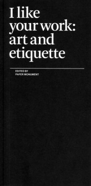
Paper Monument, I like your work: art and etiquette
Softcover, 56 pp., offset 1/1, 4.25 x 8.5 inches
Second edition
ISBN 978-0-9797575-2-5
Published by Paper Monument
$8.00 · out of stock
Paper Monument publishes its first pamphlet,
I like your work: art and etiquette, with contributions from 38 artists, critics, curators, and dealers on the sometimes serious and sometimes ridiculous topic of manners in the art world.
The art world is now both socially professional and professionally social. Curators visit artists’ studios; collectors, dealers, and journalists assemble for a reception and reconvene later for dinner; everyone goes to parties. We exchange introductions and small talk; art is bought and sold; careers (and friendships) brighten or fade. In each situation, certain behaviors are expected while others are silently discouraged. Sometimes, what’s appropriate in the real world would be catastrophic in the art world, and vice versa.
Making these distinctions on the spot can be nerve-wracking and disastrous. So we asked ourselves: What is the place of etiquette in art? How do social mores establish our communities, mediate our critical discussions, and frame our experience of art? If we were to transcribe these unspoken laws, what would they look like? What happens when the rules are broken? Since we didn’t have all the answers, we politely asked our friends for some help.
A.S. Hamrah, Amanda Trager, Andrew Berardini, Angie Keefer, Art, Bob Nickas, Criticism, Culture, Dan Nadel, David Levine, Dike Blair, Distribution, Dushko Petrovich, Ethan Greenbaum, James Bae, Jason Murison, Jay Batlle, Jessica Slaven, Kaspar Pincis, Maria Elena González, Matthew Brannon, Michelle Grabner, n+1, Naomi Fry, Paddy Johnson, Pam Lins, Paper Monument, Prem Krishnamurthy, Project Projects, Rachel Uffner, Richard Ryan, Roger White, Ryan Steadman, Sara Greenberger Rafferty, Sari Carel, Steffani Jemison, Theory, Typography, Wendy Olsoff

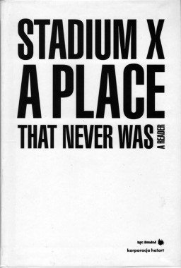
Joanna Warsza, Stadium X — A Place That Never Was
Softcover, 128 pp., offset 4/1, 135 x 195 mm
Edition of 500
ISBN 978-83-925107-6-5
Published by Laura Palmer Foundation
$20.00 ·
A mix of Socialist mausoleum, Aztec temple, and bunker system with a network of small gardens, along with a grid structure of endless market stalls — here is one of possible pictures of Socialist Realist ruin –- the 10th-Anniversary Stadium and the Jarmark Europa open-air market surounding it. After twenty years of a phantom-like existence in the middle of Warsaw, this expanse in 2008 became the construction site of a new national stadium. The book offers a selection of texts present ing a multi-faceted picture of that site’s deterioration and its bizarre existence as a ‘city within a city’. It pictures the area as a Land-Art piece and picturesque ruin, a primeval forest, a realm of precariousness and discount shopping, a work camp for archaeologists and botanists, a ‘Vietnamtown,’ a sonic phenomenon or architectural splendor. The reader also documents the series of site-specific art projects entitled The Finis sage of Stadium X curated by Joanna Warsza and provides them with a theoretical context.
The Stadium was built in 1955 from the rubble of a war-devastated, and was to preserve Communism’s good name for forty years. In the early 1990s it fell into ruin, being at the same time ‘revived’ by Vietnamese intelligentsia-cum-vendors and Russian traders, pioneers of capitalism. Jarmark Europa suddenly became the only multicultural site in the city, a storehouse of biographies and urban legends, as well as a major tourist attraction. The heterotopic logic of the place and its long-standing (non)presence in the middle of Warsaw brought about the series of art projects, and later this reader.
Over the course of time, the 10-th Anniversary Stadium which is now being erased form the map of Warsaw will likely become some distant planet, while the present publication, with the brilliant contributions from its authors, will attain — perhaps — the status of an unreal story about a place that, after all, never was.
—Daniel Miller, Frieze
Anda Rot ten berg, Art, Bar bara Sudnik-Wójcikowska, Ben jamin Cope, Cezary Polak, Claire Bishop, Criticism, Culture, Distribution, Ewa Majew ska, Grze gorz Piątek, Halina Galera, Joanna Warsza, Laura Palmer Foundation, Marek Ostrowski, Ngô Văn Tưởng, Pascal Nicolas-Le Strat, Pit Schultz, Roland Schöny, Sebas t ian Cichocki, Sport, Stach Szabłowski, Theory, Tomasz Stawiszyński, Warren Niesłuchowski

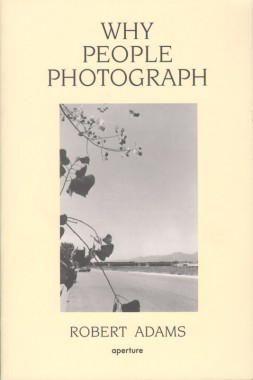
Robert Adams, Why People Photograph
Softcover, 189 pp., offset 1/1, 5.5 x 8.25 inches
Edition of 2000
ISBN 9780893816032
Published by Aperture
$15.00 ·
A now classic text on the art, Why People Photograph gathers a selection of essays by the great master photographer Robert Adams, tackling such diverse subjects as collectors, humor, teaching, money and dogs. Adams also writes brilliantly on Edward Weston, Paul Strand, Laura Gilpin, Judith Joy Ross, Susan Meiselas, Michael Schmidt, Ansel Adams, Dorothea Lange and Eugène Atget. The book closes with two essays on “working conditions” in the nineteenth- and twentieth-century American West, and the essay “Two Landscapes.” Adams writes: “At our best and most fortunate we make pictures because of what stands in front of the camera, to honor what is greater and more interesting than we are.”
Ansel Adams, Aperture, Criticism, DAP, Dorothea Lange, Edward Weston, Eugène Atget, Judith Joy Ross, Michael Schmidt, Paul Strand, Photography, Robert Adams, Susan Meiselas, Theory

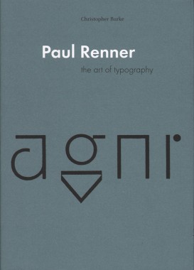
Christopher Burke, Paul Renner: the art of typography
Softcover, 224 pp., offset 4/1, 170 x 240 mm
Edition of 2000
ISBN 978-0-907259-12-1
Published by Hyphen Press
$35.00 ·
German culture in the twentieth century moved quickly and intensely, bound up with the politics of the country. Paul Renner (1878–1956) lived and worked through constituent episodes of this history, both embodying the patterns of his times and providing a critical commentary on them. In this book Christopher Burke provides the first extended account of an essential and still underrated figure.
Beginning his career in the thick of the Munich cultural renaissance, Paul Renner worked as a ‘book artist’, applying values he had learnt as a painter to this everyday item of multiple production. An early and prominent member of the Deutscher Werkbund, he was committed to the values of quality in design, always tempered by a certain sobriety of attitude and style. In the 1920s Renner engaged with the radical modernism of that time, briefly in Frankfurt, and then in a more extended phase at the printing school at Munich. Under Renner’s leadership, and with teachers such as Georg Trump and Jan Tschichold, the school produced work of quiet significance. In those years Renner undertook the design of the now ubiquitous typeface Futura. Christopher Burke’s analysis of the design process reveals the characteristic Renner approach: he took up with current tendencies, but through an extended process of finely judged development, helped to deliver a product that has long-lasting quality. In the Nazi seizure of power of 1933, Renner was dismissed from his teaching post — in days recounted here in dramatic detail — and entered a state of ‘inner emigration’. Burke’s account of the Nazi years shows Renner negotiating events with dignity. After 1945, Renner lived in retirement, but entered public discussion of design issues as a voice of experience and sanity.
Paul Renner is a work of discovery. As part of its fresh narrative and analysis, it includes much new illustrative material and the first full bibliography of Renner’s writings.
Christopher Burke, Criticism, Georg Trump, Hyphen Press, Jan Tschichold, PAP, Paul Renner, Theory, Typography

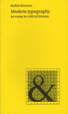
Robin Kinross, Modern typography: an essay in critical history
Softcover, 272 pp., offset 4/2, 125 x 210 mm
Edition of 2000
ISBN 978-0-907259-18-3
Published by Hyphen Press
$27.00 · out of stock
A brisk tour through the history of Western typography, from the time (c.1700 in France and England) when it can be said to have become ‘modern’. A spotlight is directed at different cultures in different times, to trace the developments and shifts in modern typography. Attention is given to ideas, to social context, and to technics, thus stepping over the limited and tired tropes of stylistic analysis.
This history of typography starts with the early years of the Enlightenment in Europe, around 1700. It was then that typography began to be distinct from printing. Instructional manuals were published, a record of the history of printing began to be constructed, and the direction of the printing processes was taken up by a new figure: the typographer. This starting point gives the discussion a special focus, missing from existing printing and design history. Modern typography is seen as more than just a modernism of style. Rather it is the attempt to work in the spirit of rationality, for clear and open communication. This idea is argued out in the introductory chapter.
The chapters that follow trace the history of typography up to the present moment. Different cultures and countries become the focus for the discussion, as they become significant. In the nineteenth century, Britain provides the main context for modern typography. In the twentieth century, the USA and certain continental European countries are prominent. Kinross provides concise accounts of modernist typography in Central Europe between the wars and in Switzerland in the 1950s and 1960s. Traditionalist typography in the USA, Britain, Germany and the Low Countries is also discussed sympathetically. A concluding chapter considers ‘modern typography’ in the light of the social, political and technical changes of the recent period.
Criticism, Hyphen Press, PAP, Robin Kinross, Theory, Typography

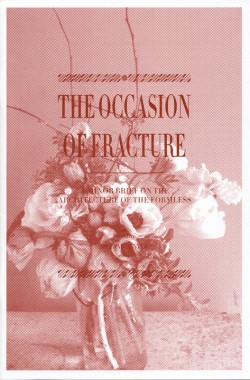
Keith Bormuth, The Occasion of Fracture
Softcover, 28 pp., offset 1/1, 160 x 240 mm
Edition of 500
Published by Keith Bormuth
$10.00 ·
Keith Bormuth’s The Occasion of Fracture traces the notion that media fulfills itself in a phatic relationship to knowledge. Following a ghost image of Reyner Banham’s seminal text on Los Angeles, Bormuth melds the on-screen laughter of the 1940s Hollywood star Irene Dunne with the show Gossip Girl, F. Scott Fitzgerald’s posthumously published The Crack Up, and the cameo appearance by Georges Bataille as a priest in Jean Renoir’s film Partie de Campagne. Composed in 11 themes, the text seeks to fracture the semblance images have as things.
Albert Reis, Art, Blair Waldorf, Chuck Bass, Criticism, Dawn Aragon, Distribution, F. Scott Fitzgerald, Georges Bataille, Guy Debord, Irene Dunne, Jean Renoir, Karl Kraus, Keith Bormuth, Manhab Renyer, Reyner Banham, Serena van der Woodson, Theory

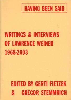
Lawrence Weiner, Having Been Said: Writings & Interviews Of Lawrence Weiner 1968-2003
Softcover, 488 pp., offset 1/1, 170 x 240 mm
Edition of 2000
ISBN 9783775791946
Published by Hatje Cantz
out of print
Lawrence Weiner’s art uses language in reference to materials. Language itself is a material and at the same time a means of presentation of his work. Weiner evolved this approach in the context of the Conceptual art of the late 60s, yet he does not see his own work as “conceptual.” The “space” he works within is the entire cultural context, and his works are associated with various different media and forms of presentation: books, posters, videos, films, records, drawings, multiples, installations indoors and outdoors, and more. Since his earliest days as a professional artist, Weiner has given written and verbal expression to questions concerning his work and its context. These utterances — statements, interviews, lectures and conference contributions — have been collected together in this publication for the first time, and ordered chronologically. Taken as a whole they afford an insight both into a complex individual biography and into the wider development of art and culture and the challenge that this entails.
Art, Criticism, DAP, Gerti Fietzek, Gregor Stemmrich, Hatje Cantz, Lawrence Weiner, Theory

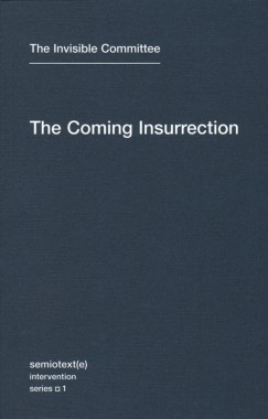
The Invisible Committee, The Coming Insurrection
Softcover, 136 pp., offset 1/1, 4.5 x 7 inches
Edition of 2000
ISBN 978-1-58435-080-4
Published by Semiotext(e)
$13.00 ·
Thirty years of “crisis,” mass unemployment, and flagging growth, and they still want us to believe in the economy…We have to see that the economy is itself the crisis. It’s not that there’s not enough work, it’s that there is too much of it.
—from
The Coming Insurrection
The Coming Insurrection is an eloquent call to arms arising from the recent waves of social contestation in France and Europe. Written by the anonymous Invisible Committee in the vein of Guy Debord — and with comparable elegance — it has been proclaimed a manual for terrorism by the French government (who recently arrested its alleged authors). One of its members more adequately described the group as “the name given to a collective voice bent on denouncing contemporary cynicism and reality.” The Coming Insurrection is a strategic prescription for an emergent war-machine to “spread anarchy and live communism.”
Written in the wake of the riots that erupted throughout the Paris suburbs in the fall of 2005 and presaging more recent riots and general strikes in France and Greece, The Coming Insurrection articulates a rejection of the official Left and its reformist agenda, aligning itself instead with the younger, wilder forms of resistance that have emerged in Europe around recent struggles against immigration control and the “war on terror.”
Hot-wired to the movement of ‘77 in Italy, its preferred historical reference point, The Coming Insurrection formulates an ethics that takes as its starting point theft, sabotage, the refusal to work, and the elaboration of collective, self-organized forms-of-life. It is a philosophical statement that addresses the growing number of those — in France, in the United States, and elsewhere — who refuse the idea that theory, politics, and life are separate realms.
Reviews
“…without a doubt the most thought-provoking radical text to be published in the past ten years. It deserves to be read and discussed.”
—Daniel Miller, New Statesman
“Any book indirectly responsible for massive raids involving helicopters and anti-terrorist police, a splenetic Fox News broadcast and an impromptu book-reading at a Barnes & Noble bookshop in New York (also attended by the police) must have something going for it. And so it is with The Coming Insurrection, the kind of political pamphlet last fashionable in the 17th century (and perhaps for a period in the 1960s and ‘70s).”
—Nina Power, Frieze Magazine
“I am not calling for a ban on this book. It’s important that you read this book. [...] And let me tell you something: Don’t dismiss these people. Don’t dismiss them.”
—Glenn Beck, Fox News/Glenn Beck Program
Criticism, MIT Press, Semiotexte, The Invisible Committee, Theory

Un Coup de Dés: Writing Turned Image. An Alphabet of Pensive Language
Softcover, 250 pp., offset 4/1, 215 x 280 mm
Edition of 5000
ISBN 9783865605436
Published by Walther König
$60.00 · out of stock
In her essay “Writing Turned Image. An Alphabet of Pensive Language,” Sabine Folie writes, “An idea…explored in Stéphane Mallarmé’s Un coup de dés (A roll of the dice) of 1897 has in the twentieth century become an integral part of the poetological and, more generally, the avant-gardist vocabulary: the idea of unmasking language as a convention whose purpose it is to discipline the individual and to subject it to a regulated system of capitalist exploitation as well as to guarantee orientation in the world… Writing was released from the textual ensemble of the book and integrated into the flow of its media — as a disturbance, a deconstruction of meaning.” The ideas of Symbolist poet and galvanizing nineteenth-century intellectual Stéphane Mallarmé are discussed in this text-heavy volume in relation to works by Robert Barry, Lothar Baumgarten, Marcel Broodthaers, Theresa Hak Kyung Cha and Rodney Graham, among others. Scholarly essays by Sabine Folie, Anna Sigridur Arnar, Jacques Rancière, Gabriele Mackert and Michael Newman accompany a generous selection of images by each of the artists.
Ana Torfs, Anna Sigridur Arnar, Art, DAP, David Lamelas, Dietrich Karner, Dominik Steiger, Ewa Partum, Gabriele Mackert, Gerhard Ruhm, Ian Wallace, Jacques Rancière, Jaroslaw Kozlowski, Joelle Tuerlinckx, Klaus Scherubel, Lothar Baumgarten, Marcel Broodthaers, Michael Newman, Peter Tscherkassky, Robert Barry, Rodney Graham, Sabine Folie, Stéphane Mallarmé, Theory, Theresa Hak Kyung Cha, Ulrike Grossarth, Walther König

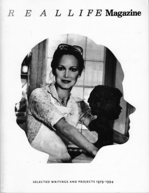
Real Life Magazine: Selected Writing and Projects 1979-1994
Softcover, 320 pp., offset 1/1, 8.25 x 11 inches
Edition of 1000
ISBN 9780978869700
Published by Primary Information
$30.00 · out of stock
Real Life Magazine: Selected Writings and Projects 1979-1994 highlights a selection of writings and artists’ projects from Real Life magazine, which was originally edited by artist, writer, and curator, Thomas Lawson and writer, Susan Morgan. Published in twenty-three issues from 1979-1994 as an intermittent black and white magazine, Real Life featured artists and art historians writing on art, media and popular culture interspersed with pictorial contributions. The development of the magazine through its 15 year history, traces the influences, development and transitions of artists through the 80s.
The anthology features writings by and about Dara Birnbaum, Eric Bogosian, Rhys Chatham, Mark Dion, Jack Goldstein, Felix Gonzalez-Torres, Kim Gordon, Dan Graham, Thomas Lawson, Louise Lawler, Sherrie Levine, Allan McCollum, John Miller, Dave Muller, Matt Mullican, Adrian Piper, Richard Prince, David Robbins, Ed Ruscha, Cindy Sherman, Laurie Simmons, Michael Smith, John Stezaker, Bernard Tschumi, Jeff Wall, Lawrence Weiner, and James Welling among others.
Adrian Piper, Allan McCollum, Art, Bernard Tschumi, Cindy Sherman, Dan Graham, DAP, Dara Birnbaum, Dave Muller, David Robbins, Ed Ruscha, Eric Bogosian, Felix Gonzalez-Torres, Jack Goldstein, James Welling, Jeff Wall, John Miller, John Stezaker, Kim Gordon, Laurie Simmons, Lawrence Weiner, Louise Lawler, Mark Dion, Matt Mullican, Michael Smith, Miriam Katzeff, Primary Information, Rhys Chatham, Richard Prince, Sherrie Levine, Susan Morgan, Theory, Thomas Lawson

Helen Mirra, Cloud, the, 3
Hardcover, 304 pp., offset 4/1, 140 x 195 mm
Edition of 5000
ISBN 978-3-905770-17-9
Published by JRP|Ringier, CK editions
$45.00 ·
For the past few years Helen Mirra’s writing has been in the form of the index. Dislocated from a source text, the entries point out into the world at large. This volume relies upon John Dewey’s “Reconstruction in Philosophy” (1920). While Dewey’s book is largely about the conceptualization of ideas, Mirra’s project is a materialization of conceptualization, under the auspices of a spare poetics.
This publication is part of the series of artists projects edited by Christoph Keller. Personally selected by Keller, for Textfield, as one of his top five from the series.
Art, Christoph Keller, CK editions, DAP, Helen Mirra, JRP|Ringier, Lyn Hejinian, Theory
