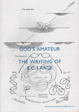
God’s amateur: the writing of E.C. Large
Stuart Bailey and Robin Kinross, God’s amateur: the writing of E.C. Large
Softcover, 96 pp., offset 3/1, 170 x 240 mm
Edition of 2000
ISBN 978-0-907259-38-1
Published by Hyphen Press
$20.00 ·
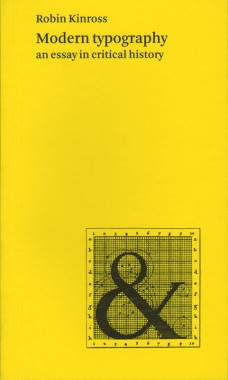
Modern typography: an essay in critical history
Robin Kinross, Modern typography: an essay in critical history
Softcover, 272 pp., offset 4/2, 125 x 210 mm
Edition of 2000
ISBN 978-0-907259-18-3
Published by Hyphen Press
$27.00 · out of stock
This history of typography starts with the early years of the Enlightenment in Europe, around 1700. It was then that typography began to be distinct from printing. Instructional manuals were published, a record of the history of printing began to be constructed, and the direction of the printing processes was taken up by a new figure: the typographer. This starting point gives the discussion a special focus, missing from existing printing and design history. Modern typography is seen as more than just a modernism of style. Rather it is the attempt to work in the spirit of rationality, for clear and open communication. This idea is argued out in the introductory chapter.
The chapters that follow trace the history of typography up to the present moment. Different cultures and countries become the focus for the discussion, as they become significant. In the nineteenth century, Britain provides the main context for modern typography. In the twentieth century, the USA and certain continental European countries are prominent. Kinross provides concise accounts of modernist typography in Central Europe between the wars and in Switzerland in the 1950s and 1960s. Traditionalist typography in the USA, Britain, Germany and the Low Countries is also discussed sympathetically. A concluding chapter considers ‘modern typography’ in the light of the social, political and technical changes of the recent period.
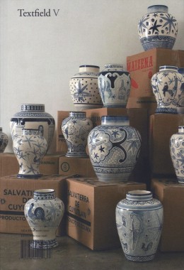
Textfield V
Textfield V
Softcover, 128 pp., offset 4/1, 6.5 x 9.5 inches
Edition of 2500
ISSN 1934-2446
Published by Textfield
$20.00 ·
Contributors; Darren Bader, Stuart Bailey, Nina Jan Beier, Chris Bolton, Rainer Borgemeister, Binna Choi, Ryan Conder, Chris Cullens, Jason DeLeón, Thomas Eberwein, Marco Fiedler, Steve Hanson, Danielle Kays, Robin Kinross, Marc Kremers, Marie Jan Lund, Yukinori Maeda, Miltos Manetas, Emily Mast, Slobodan Milosevic, Angelos Plessas, Manuel Raeder, Achim Reichert, Rafaël Rozendaal, Eduardo Sarabia, Artur Schmal, Nanette Sullano, Gerard Unger, Amy Yao, and Cosmic Wonder.
Andy de Fiets: Letter to Robin Kinross
Paul Haworth and Sam de Groot, Andy de Fiets: Letter to Robin Kinross
Softcover, 24 pp., mimeographed black and red, 125 x 206 mm
Edition of 500
ISBN 978-94-90006-01-3
Published by True True True
$12.00 ·
22-year-old Andy de Fiets, on the verge of graduating from his graphic design studies, writes to his hero: Hyphen Press publisher Robin Kinross. Andy offers unsolicited advice, seeks much-needed guidance, and shares his thoughts on matters such as typography, The Smiths, Islamic fundamentalism, proper clothing, the homeless, dust covers. Andy spots every comma but misses every point. A delightful typographic comedy!


