Mr. Bumba Draws a Kitten
Pearl Augusta Harwood, Mr. Bumba Draws a Kitten
Hardcover, 32 pp., offset 3/2, 8.25 x 9.25 inches
Fifth edition
ISBN 0-8225-0107-4
Published by Lerner Publications
$11.00 ·
Mr. Bumba was a painter of pictures. One day he wanted to make a picture of a kitten. But he could not remember just how to do it.
Copyright 1966 by Lerner Publications Company; fifth edition published in 1974. The type used in this book is Mr. Bumba Text set in 16 point.
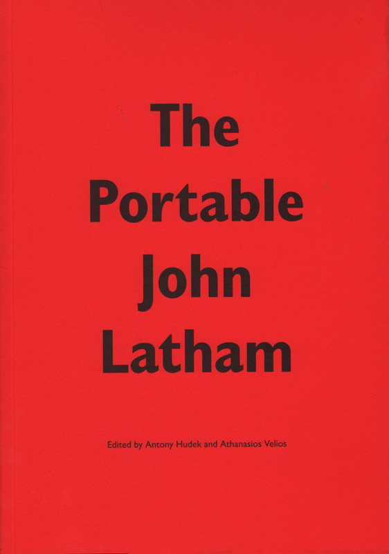
The Portable John Latham
Antony Hudek and Athanasios Velios, The Portable John Latham
Softcover, 112 pp., offset 2/1, 170 x 250 mm
Edition of 1000
ISBN 978-0-9562605-5-0
Published by Occasional Papers
$22.00 ·
Edited and introduced by Antony Hudek and Athanasios Velios.
In the painting and sculpture for which he is best known, Latham’s primary materials included glass, books, canvas and the spray gun. Developing alongside this concise visual language, from the mid-1950s onwards, was a cosmological theory, formulated through his art-making discoveries, that considered time and event to be more primary than the established means of understanding, based on space and matter. Termed Time-Base Theory (sometimes Flat Time Theory or Event Theory) it offers an ordering and unification of all events in the universe, including human actions, and allows an understanding of the special status of the artist in society.
Latham looked at the way in which human knowledge has become fragmented over time; split by divergent religions, ideologies and world-views. He identified the way in which the fields of science and art, despite emerging from a common root, have become separate and operate in isolation of one another: even within a field such as physics, there exist a large number of schisms and specialisations that further fragment our knowledge and understanding of the universe. John believed that this endless division would eventually lead to a kind of entropy and from that state, to a disintegration of society.
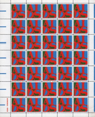
General Idea, AIDS Stamps
General Idea, AIDS Stamps
Perforated paper, offset 3/0, 210 x 255 mm
Edition unknown, unsigned
1988 / 8804
Published by General Idea
$150.00 ·
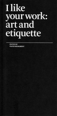
I like your work: art and etiquette
Paper Monument, I like your work: art and etiquette
Softcover, 56 pp., offset 1/1, 4.25 x 8.5 inches
Second edition
ISBN 978-0-9797575-2-5
Published by Paper Monument
$8.00 ·
The art world is now both socially professional and professionally social. Curators visit artists’ studios; collectors, dealers, and journalists assemble for a reception and reconvene later for dinner; everyone goes to parties. We exchange introductions and small talk; art is bought and sold; careers (and friendships) brighten or fade. In each situation, certain behaviors are expected while others are silently discouraged. Sometimes, what’s appropriate in the real world would be catastrophic in the art world, and vice versa.
Making these distinctions on the spot can be nerve-wracking and disastrous. So we asked ourselves: What is the place of etiquette in art? How do social mores establish our communities, mediate our critical discussions, and frame our experience of art? If we were to transcribe these unspoken laws, what would they look like? What happens when the rules are broken? Since we didn’t have all the answers, we politely asked our friends for some help.
The Form of the Book Book
Sara De Bondt and Fraser Muggeridge, The Form of the Book Book
Softcover, 96 pp., offset 2/1, 140 x 230 mm
Edition of 1000
ISBN 978-0-9562605-1-2
Published by Occasional Papers
out of print
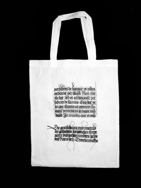
Performance
Harsh Patel, Performance
Cotton tote bag, screenprint 1/0, 297 × 420 mm
Published by Harsh Patel
$25.00 ·
Annotated Catalogue Raisonné of the Books by Martin Kippenberger 1977-1997
Martin Kippenberger, Annotated Catalogue Raisonné of the Books by Martin Kippenberger 1977-1997
Softcover, 368 pp., offset 1/1, 8.25 x 11 inches
Edition of 5000
ISBN 9781891024658
Published by Distributed Art Publishers
$55.00 ·
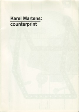
Karel Martens: Counterprint
Karel Martens: Counterprint
Softcover, 32 pp., offset 4/4, 210 x 297 mm
Edition of 4000
ISBN 978-0-907259-25-1
Published by Hyphen Press
$35.00 ·
This is the first publication devoted to Martens’s prints. It is made in association with the printer Lecturis, in Eindhoven, and is produced to the highest quality. Bound in Chinese/Japanese fashion, like the first Martens book, it has a strong quality as an object. The main text in the book is an essay by the English designer Paul Elliman: ‘The world as a printing surface’. Dutch critic and teacher Carel Kuitenbrouwer provides a short introduction. The book is designed by Hans Gremmen, under the supervision of Karel Martens, at the Werkplaats Typografie in Arnhem.
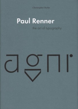
Paul Renner: the art of typography
Christopher Burke, Paul Renner: the art of typography
Softcover, 224 pp., offset 4/1, 170 x 240 mm
Edition of 2000
ISBN 978-0-907259-12-1
Published by Hyphen Press
$35.00 ·
Beginning his career in the thick of the Munich cultural renaissance, Paul Renner worked as a ‘book artist’, applying values he had learnt as a painter to this everyday item of multiple production. An early and prominent member of the Deutscher Werkbund, he was committed to the values of quality in design, always tempered by a certain sobriety of attitude and style. In the 1920s Renner engaged with the radical modernism of that time, briefly in Frankfurt, and then in a more extended phase at the printing school at Munich. Under Renner’s leadership, and with teachers such as Georg Trump and Jan Tschichold, the school produced work of quiet significance. In those years Renner undertook the design of the now ubiquitous typeface Futura. Christopher Burke’s analysis of the design process reveals the characteristic Renner approach: he took up with current tendencies, but through an extended process of finely judged development, helped to deliver a product that has long-lasting quality. In the Nazi seizure of power of 1933, Renner was dismissed from his teaching post — in days recounted here in dramatic detail — and entered a state of ‘inner emigration’. Burke’s account of the Nazi years shows Renner negotiating events with dignity. After 1945, Renner lived in retirement, but entered public discussion of design issues as a voice of experience and sanity.
Paul Renner is a work of discovery. As part of its fresh narrative and analysis, it includes much new illustrative material and the first full bibliography of Renner’s writings.
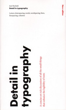
Detail in typography
Jost Hochuli, Detail in typography
Softcover, 64 pp., offset 2/2, 125 x 210 mm
Edition of 2000
ISBN 978-0-907259-34-3
Published by Hyphen Press
$25.00 ·
Detail in typography, designed by its author, is printed and bound in Switzerland to the best standards. It provides, in its own form and manufacture, a demonstration of how books can be made.
Modern typography: an essay in critical history
Robin Kinross, Modern typography: an essay in critical history
Softcover, 272 pp., offset 4/2, 125 x 210 mm
Edition of 2000
ISBN 978-0-907259-18-3
Published by Hyphen Press
$27.00 · out of stock
This history of typography starts with the early years of the Enlightenment in Europe, around 1700. It was then that typography began to be distinct from printing. Instructional manuals were published, a record of the history of printing began to be constructed, and the direction of the printing processes was taken up by a new figure: the typographer. This starting point gives the discussion a special focus, missing from existing printing and design history. Modern typography is seen as more than just a modernism of style. Rather it is the attempt to work in the spirit of rationality, for clear and open communication. This idea is argued out in the introductory chapter.
The chapters that follow trace the history of typography up to the present moment. Different cultures and countries become the focus for the discussion, as they become significant. In the nineteenth century, Britain provides the main context for modern typography. In the twentieth century, the USA and certain continental European countries are prominent. Kinross provides concise accounts of modernist typography in Central Europe between the wars and in Switzerland in the 1950s and 1960s. Traditionalist typography in the USA, Britain, Germany and the Low Countries is also discussed sympathetically. A concluding chapter considers ‘modern typography’ in the light of the social, political and technical changes of the recent period.
Invisible Language Workshop

Not Equal, 2009, Plywood, wood glue and enamel paint, 13.1 x 17.75 inches
Shannon Ebner
Invisible Language Workshop
30 October — 19 December 2009
Opening Reception: Friday 30 October, 6-8pm
Wallspace
—Shannon Ebner
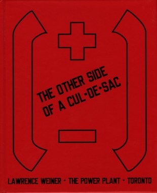
The Other Side of A Cul-De-Sac
Lawrence Weiner: The Other Side of A Cul-De-Sac
Hardcover, 48 pp., offset 3/1, 185 x 225 mm
Edition of 900
ISBN 9781894212250
Published by The Power Plant
$35.00 ·
